Print

NextGen Artist Global Report designed by Elsie Lam.

NextGen Artists Global Report

Project The inaugural NextGen artist global report delves deep into the contemporary art market to…
Triple Happiness Food Company

Triple Happiness Food Company

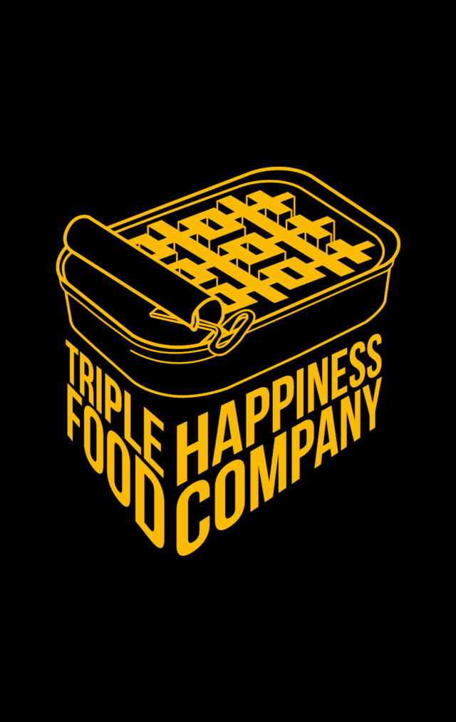
The traditional Chinese character for joy or happiness is “喜”. Traditionally, the double happiness character “囍” is often seen on red envelops and decorations for weddings and at Chinese New Year. The concept of this branding design is an opening sardine tin revealing three copies of “喜” characters making it Triple Happiness.

The business cards design reflect a traditional red pocket money envelop which is given out at ceremonies and Chinese New Year.

Risk Specialist Magazine designed by Elsie Lam

Risk Specialist Magazine

About Risk Specialist is a global magazine and there are two divisional sister-magazines that sit…
Jackpot Chicken Rice visual identity designed by Elsie Lam.

Jackpot Chicken Rice

About Jackpot Chicken Rice was a colourfully-hip chicken rice restaurant in the heart of Toronto’s…
Patois Toronto. Visual Identity designed by Elsie Lam.

Patois Toronto

About In the same way as the Jamaica’s national language, “Patois” is the merging of…